
BRANDING · AUGUST 18, 2026
Branding for Therapists: A Step-by-Step Framework to Build Yours
If you're reading this, you've probably already made peace with the idea that your practice needs a brand. What you actually want is the next part: a sequence you can follow this week, not another article explaining why sage green and a lotus icon won't cut it.
If you're reading this, you've probably already made peace with the idea that your practice needs a brand. What you actually want is the next part: a sequence you can follow this week, not another article explaining why sage green and a lotus icon won't cut it. (If you do want the "why" — the research on client trust, the ethics rules, the real cost of a bad brand.
This is the "how." Five steps, in order, each one building on the last, plus a section most branding guides skip entirely: what changes when you're not a solo practitioner.
Step 1: Define your ideal client before you touch a color
Every branding decision downstream of this one — palette, tone, homepage headline — only works if this step is done first. Skip it and you'll pick colors you like instead of colors that work.
Your ideal client isn't a diagnosis. "Anxiety" describes half your caseload and none of your positioning. A usable definition names a situation and a moment: a new parent whose anxiety showed up after the baby arrived, a mid-career professional who finally has the insurance to afford therapy and no idea where to start, a couple who agreed to try six sessions before deciding anything permanent.
Write down the types of client you actually want more of, then answer these in their words, not clinical ones:
- What are they typing into Google at 11 p.m.?
- What have they already tried that didn't help?
- What do they assume a therapist will think of them?
- What would make them close the tab and keep scrolling?
Those four answers become your homepage copy, your Psychology Today profile, and your intake form's tone. They're also how you attract clients you actually want to work with, instead of just more inquiries.
Step 2: Write your unique value proposition in one sentence
A unique value proposition (UVP) is the sentence a client could repeat to a friend when explaining why they picked you. Most therapist websites don't have one — they have a mission statement, which is a different thing aimed at a different reader.
Use this formula as a starting draft:
"I help [specific type of client] who are struggling with [specific problem] move toward [specific, honest outcome] through [what actually makes your approach different]."
Filled in, it might read: "I help new parents whose anxiety spiked after birth move toward feeling steady again, through EMDR and a practice that never asks you to find childcare for your own session."
Notice what that sentence does. It names a client, a problem, a direction (not a guarantee — more on why that distinction matters in a moment), and one concrete detail that couldn't apply to any other practice. Compare that to "compassionate, client-centered care for individuals and families," which could sit on ten thousand websites unchanged.
One caution as you draft: keep the outcome language honest. "Move toward feeling steady" is a direction. "Resolve your anxiety in 12 sessions" is a promise licensing boards don't let you make, and it's weaker copy besides — specific claims about approach are more credible than vague claims about results. The Ethical Marketing section of this blog covers exactly where that line sits for your license type.
Step 3: Choose visual elements that signal the right thing
Once your UVP exists, the visual identity — palette, typography, a simple mark — has a job: match what the sentence already says, not decorate a blank page.
Color carries meaning fastest, and it's also where therapy branding gets stuck in a loop. Here's what different palette families actually signal, and where they've become so common they stop standing out:
| Color | What it signals | Common in | Consider instead |
|---|---|---|---|
| Sage green | Calm, familiar, "safe space" | The overwhelming majority of therapy sites | Warm clay or terracotta — same approachability, far less sameness |
| Dusty blue | Trust, clinical calm | Psychologists, EAP-style practices | A deeper, more saturated blue for a bit more authority |
| Deep plum or slate | Serious, contained | Rare — which is exactly why it works well for trauma-focused work | Pair with generous whitespace so "serious" doesn't read as cold |
| Warm terracotta or ochre | Approachable, human, distinctive | Still underused in this space | A strong option if your ideal client responds better to warmth than to clinical polish |
The general rule: what a visitor feels in the first second is decided before they read a word, so pick a direction on purpose instead of defaulting to whatever the last ten practices you looked at were using.
Typography does more work than most therapists expect. A serif with real character for headlines, paired with a clean, humanist sans for body text, separates you from the Montserrat-on-white look immediately — and it's a five-minute decision once you know your two fonts.
Keep the mark itself simple. A wordmark set in your display typeface, with one small distinguishing detail, is enough. Nobody has chosen a therapist because of an icon; they've chosen one because the whole picture — palette, type, words — felt like it was built for them specifically.
Step 4: Write brand messaging that builds trust
Messaging is where visual identity turns into words a potential client actually reads. Three things make messaging feel trustworthy rather than generic.
Specificity over reassurance
"You're not alone" appears on nearly every therapy homepage and reassures no one anymore because it says nothing about this practice. "I work with first responders navigating the gap between what the job asks of them and what they can carry home" says more in one sentence than a paragraph of warmth-signaling ever will.
A voice, held consistently
Pick three adjectives — steady, direct, warm; or unhurried, curious, plain-spoken — and let them shape every sentence on the site, not just the "About" page. Voice is what makes a practice sound like one specific person instead of a category of service.
Boundaries stated plainly
What you don't treat, what a first session actually costs, how scheduling works. Ambiguity reads as evasion to someone already anxious about reaching out.
What you leave out matters as much as what you include: no client testimonials, no "as seen in" badges built on outcome claims, no before-and-after language. Those aren't just risky for licensing purposes — they're also the exact tactics that make every other small-business brand sound the same, so skipping them is a differentiator, not just a compliance box.
Step 5: Make it consistent everywhere a client meets you
A brand that only lives on the homepage isn't a brand yet. Consistency means the same palette, the same voice, and the same promise across:
- your website and your Psychology Today or directory listing
- intake paperwork and appointment reminders
- social media, if you use it
- the physical or virtual room itself — how you introduce the first session
Build a one-page brand reference — palette hex codes, your two fonts, your three voice adjectives, your UVP sentence — and use it every time you write or design something new. It takes an afternoon to build and saves you from re-deciding your brand every time you open a new tool.
Branding for group practices and collectives
Almost everything above assumes a solo practitioner, and almost every branding guide online makes the same assumption. If you're building a group practice or a therapy collective, three decisions change.
Name the practice, not the founder
A personal name (Dr. Chen Therapy) works well for a solo clinician but creates friction the moment you hire an associate — the brand and the founder become inseparable, which limits both growth and resale value later. A practice name (something like Elm & Ember Counseling) gives every clinician equal footing under one identity.
One visual system, several voices
The palette, typography, and UVP framework above still apply at the practice level — that's your shared shell. But each clinician needs a short individual bio that carries their own specialty and tone within it, so a client can tell the difference between the trauma specialist and the couples specialist on the same team.
Consistency becomes a policy, not a habit
With one person, staying on-brand is a matter of memory. With five clinicians each posting, writing bios, and updating profiles, it has to be written down — the one-page brand reference from Step 5 stops being optional and becomes the document every new hire gets on day one.
Common mistakes when building a strong brand
A few patterns show up again and again in practices that struggle to make their branding stick:
- Starting with the logo. Design decisions made before the UVP exists usually get redone once the UVP is finally written.
- Copying what's already common. Sage and a soft serif read as "safe" mainly because everyone else is using them — copying the category doesn't borrow its trust, it just adds to the sameness.
- Treating consistency as optional. A polished website next to an inconsistent Instagram or an outdated directory photo undoes the work the website did.
- Confusing a mission statement with a UVP. One explains your values to you; the other tells a stranger why to choose you. You need both, but they're not interchangeable.
Do it yourself, hire it out, or something in between
None of the five steps above require design software or a marketing degree — they require honest answers and about a weekend. If you'd rather not build the visual system from scratch, a guided brief and AI-generated brand kit can turn the same inputs — ideal client, UVP, voice — into a complete identity in under an hour, at a fraction of a custom studio's cost. The full cost comparison across paths is worth reading before you decide.
FAQ
Does branding for therapists work differently by state?
The framework doesn't change by state — your visuals, UVP, and messaging process are the same in California, New York, or anywhere else. What does change is advertising language: state licensing boards layer their own rules on top of your national code (ACA, APA), so double-check anything outcome-related against your specific board before it goes live.
How long does it actually take to build a brand?
The thinking — Steps 1 and 2 — takes most people a few honest hours, spread over a week. The visual and messaging execution can take an afternoon with a guided tool or several weeks with a custom designer, depending on the path.
Do I need a logo, or is a wordmark enough?
A clean wordmark in your display typeface is enough for the overwhelming majority of practices. A custom icon or symbol is a "nice to have" once everything else is working, not a prerequisite.
Can I use client testimonials as part of my branding?
For most license types, no — soliciting testimonials is restricted, and even an unsolicited one risks confirming someone is a client. Lead with specific, honest positioning instead; it does the same trust-building work without the risk. More on what's allowed here.
What's different about branding for a group practice or collective?
Mainly three things: the practice needs its own name rather than a founder's name, the shared visual system has to leave room for each clinician's individual voice, and the brand reference document goes from a nice habit to a required onboarding piece. See the section above for the full breakdown.
Your brand doesn't need to be loud to work. It needs to be specific enough that the right client recognizes themselves in it — and consistent enough that they see the same practice everywhere they look for you.
Your practice, branded. In under an hour.
A guided brief, three directions, and website copy ready to paste in.
Build my brand kitMore in Branding
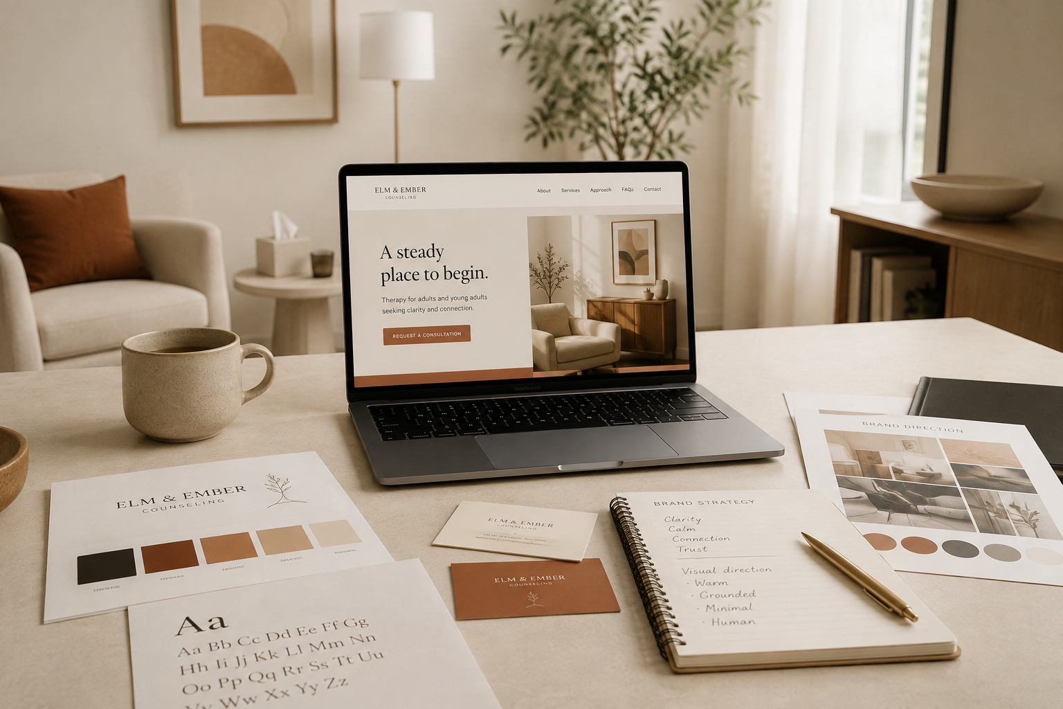
Therapist Branding: How to Build a Practice Brand People Actually Trust
Open ten therapist websites in a row and something uncomfortable happens. Sage green. A lotus. A dandelion letting go of its seeds. A headline promising a safe space to heal. Every practice is warm, every practice is welcoming, and after the fourth tab they blur into one.
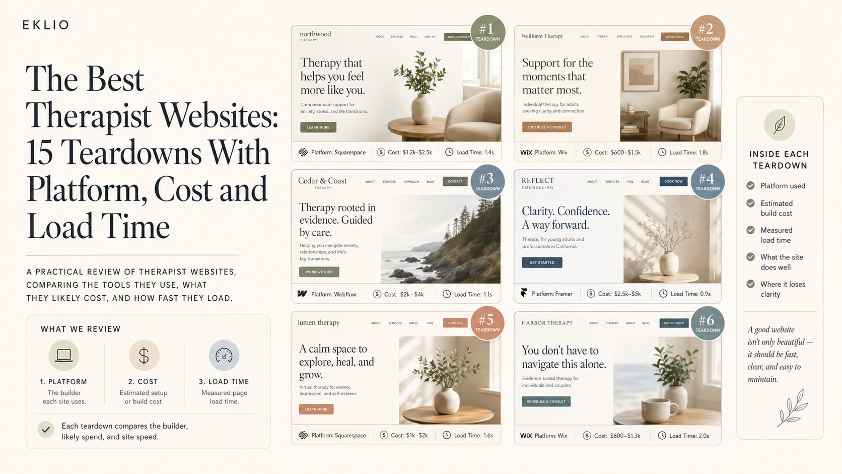
The Best Therapist Websites: 15 Teardowns With Platform, Cost and Load Time
Most "best of" lists for therapist sites are a gallery with no criteria. We opened the source on fifteen, ran each through Lighthouse on throttled mobile, priced the build, and ranked them.
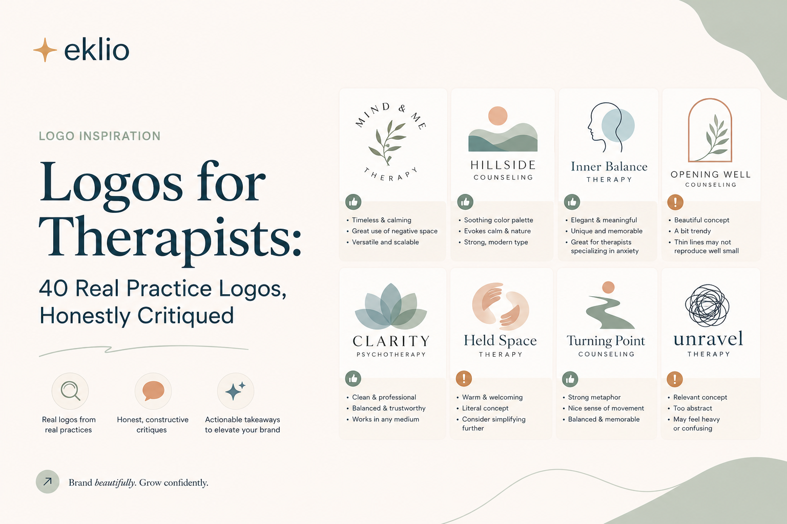
Logos for Therapists: 40 Real Practice Logos, Honestly Critiqued
We shrank forty real therapist logos to 32 pixels to see which ones survived. Eleven did. Here is what the other twenty-nine got wrong, and the six symbols we saw over and over.