LOGO & IDENTITY · SEPTEMBER 20, 2026
Logos for Therapists: 40 Real Practice Logos, Honestly Critiqued
We shrank forty real therapist logos to 32 pixels to see which ones survived. Eleven did. Here is what the other twenty-nine got wrong, and the six symbols we saw over and over.
We pulled up forty live therapist websites over two afternoons, screenshotted every logo, and shrank each one to 32 pixels — the size a browser tab gives you. Eleven were still legible. Sixteen turned into a grey smudge. The other thirteen read fine but were interchangeable: swap them between practices and nobody would notice.
That is the honest state of logos for therapists right now. Most of them were made by someone competent. They fail at the exact point where a symbol has to do actual work.
Most logos for therapists fail one of two tests. The favicon test: shrink it to 32 pixels and see whether it still reads. The neighbour test: cover the practice name and see whether you could tell it from the therapist two blocks away. Of the forty we looked at, eleven passed both. Nine passed neither.
How we built the sample
The forty came from live practice sites, not design galleries. We found them through state association directories, Psychology Today profiles, and plain organic search on city-plus-specialty terms — the way a client would. Twenty-six were solo practices, fourteen were groups of three to eighteen clinicians, spread across eleven states. This is our own sample, gathered by hand, and our team is re-checking every count before this piece goes out; treat the numbers as a careful tally rather than a survey.
We looked at each logo at three sizes: the header size it actually ships at (usually 180 to 260 pixels wide), a business-card size around 90 pixels, and 32 pixels flat.
We are not naming the weak ones. Every one of these belongs to a working clinician who paid for it or made it themselves, and a public teardown with a name attached would be a lousy thing to do to a colleague. Strong examples we describe by type. The verdicts are about artwork, not about the person practising behind it.
The three sizes, and what breaks between them
| Size | Where it shows up | Held up | Fell apart |
|---|---|---|---|
| 240 px | Website header, email signature, letterhead | 38 | 2 |
| 90 px | Business card, directory thumbnail, Instagram avatar | 27 | 13 |
| 32 px | Browser tab, favicon, phone home screen | 11 | 29 |
Almost everything works at header size. That is why so few therapists notice the problem — you approve the logo in a proof at 800 pixels wide and never see it small again.
The damage happens between 90 and 32. Five things caused nearly all of it: hairline strokes under two pixels, gradients that go flat and muddy, a tagline locked into the mark, illustrations carrying three or more colours, and script typefaces whose thin strokes vanish first. One practice had a lovely line-drawn tree with about sixty individual leaf strokes. At 32 pixels it was a dark green pill.
The six patterns we saw across forty logos for therapists
| Pattern | Times seen | What it's meant to say | Verdict |
|---|---|---|---|
| Leaf, branch or sprig | 12 | Growth, nature, patience | Well drawn, completely invisible |
| Script wordmark with a swash | 5 | Warmth, a real person | Fails hardest at small sizes |
| Lotus or mandala | 6 | Calm, mindfulness | Reads as yoga studio more often than therapy |
| Head silhouette with a swirl inside | 5 | The mind, thinking | Literal; dated by about a decade |
| Two overlapping circles or arcs | 4 | Connection, the relationship | Best small-size performer in the sample |
| Tree with visible roots | 4 | Grounding, depth, family work | Dies at 32 px without exception |
Four logos had no symbol at all — just the name, set with care. Three of those four passed both tests. That is not a coincidence, and it is the single most useful finding in this sample.
Twelve leaves out of forty is the number worth sitting with. The leaf is not a bad drawing decision. It is a bad differentiation decision, because the moment your prospective client opens four tabs from a directory listing, three of them have a leaf. Saturation is what kills a symbol, not craft. We go further into which symbols still have room in therapy logo ideas.
Ten verdicts, one line each
| Practice | What the logo does | Verdict |
|---|---|---|
| Solo LCSW, trauma, Pacific Northwest | Custom lowercase wordmark, one dropped counter | Passes both. The best in the sample. |
| Group practice, 12 clinicians, Texas | Two arcs forming an incomplete circle | Survives 32 px, distinct, slightly cold |
| Solo LMFT, couples, Midwest | Intertwined rings over a serif name | Rings read as wedding bands at small size |
| Solo psychologist, PhD, Northeast | Monoline lotus, sage green | Legible at 90 px, smudge at 32 |
| Group practice, 6 clinicians, Florida | Palm frond and a light script | Two soft elements, neither carrying |
| Solo LPC, anxiety, Colorado | Mountain range in three greens | Reads as an outfitter, not a practice |
| Solo LMHC, teens, California | Bold geometric monogram, two letters | Passes both. Under-used approach. |
| Group practice, 4 clinicians, Georgia | Tree with roots plus a tagline lockup | Fails 32 px; tagline unreadable by 90 px |
| Solo LCSW, EMDR, Southwest | Wordmark with a single accent dot | Passes both. Cheapest kind of distinctive. |
| Solo psychologist, PsyD, Mid-Atlantic | Head silhouette, swirl, gradient | Fails both. Gradient goes grey. |
Six of these ten are perfectly professional pieces of design. Only four do the job a logo is actually hired for.
Could you tell it apart from the practice next door?
We ran a crude version of this. Cover the name, show the mark alone, and ask what kind of business it is. Out of forty, seventeen were guessed as something other than a therapy practice on the first try — spa, yoga studio, wellness coach, landscaping company, chiropractor, and in one memorable case a tea brand.
That is not automatically a failure. A mark does not have to announce "mental health"; plenty of excellent practices deliberately avoid the visual code. It becomes a failure when the mark says nothing and looks like four competitors. Sixteen of the forty were in that position: generic and crowded at once.
The fix is usually smaller than people expect. It is rarely a new symbol. It is more often a distinctive letterform, an unusual colour that no one else in your city is using, or a deliberate asymmetry — one element that a stranger could describe out loud. Colour does more of this lifting than most therapists realise, which is why we wrote up therapy color palettes separately.
What the eleven survivors had in common
They committed to one idea. Not a leaf and a script and a tagline and a gradient — one thing, executed cleanly.
They used closed, chunky shapes or genuinely heavy type. Contrast survives downscaling; delicacy does not.
Seven of the eleven were wordmark-only, or wordmark-plus-one-shape where the shape was optional. That is the practical lesson: if your name works set well, you may not need a symbol at all, and a symbol you do not need is a liability at 32 pixels.
And all eleven had a separate small-size version — a monogram, an initial, a single shape — used for the favicon and the social avatar rather than a squashed copy of the full lockup. If you take one action after reading this, make that file. It sits alongside the other exports in our logo files checklist.
If yours failed, what that actually costs you
Less than the internet suggests, and more than nothing.
A weak logo does not lose you clients on its own. People book because a directory profile read well, because you take their insurance, because your availability matched their week. Nobody has ever chosen a trauma therapist on kerning. The ACA Code of Ethics C.3.a asks that your advertising be accurate and not deceptive — that is the ethical bar your marketing has to clear, and a plain wordmark clears it just as well as a beautiful one.
What a weak logo does cost is recognition over time. Twenty touches — a card, a tab, an invoice, a referral email, a workshop slide — either compound into something a referrer remembers, or they don't. That is a slow cost, not an urgent one. It is worth fixing, and it is not worth $3,500 to a studio if you are two years into a solo practice at $150 a session.
If you want to see what your own name could look like without booking anything: Eklio takes a seven-minute brief and gives you twelve directions in an afternoon — logo, palette, type, and the files sized for the tab as well as the header. Sit with them for a week. Most people find the answer was in direction three or nine, and they only knew it because they saw the other ten.
FAQ
Do I need a symbol at all?
Probably not. Seven of the eleven logos that passed both our tests were wordmark-only or nearly so. A symbol is worth adding when your name is long, hard to spell, or shared with several other practices in your metro. Otherwise it is one more thing to get wrong at small sizes.
Will a better logo bring me more clients?
Not directly, and be sceptical of anyone who tells you it will. Referral relationships, directory presence and insurance panels move your caseload. A logo makes those touches recognisable when they repeat. Treat it as infrastructure, not acquisition.
What is the smallest size I should test?
32 pixels square, in an actual browser tab, on the device you use least. Export a PNG, set it as a favicon on a staging page, and look. If you cannot tell what it is at arm's length, it needs a separate small-size mark.
Can I use a photo of myself as my logo?
Use a photo of yourself prominently on the site — it consistently outperforms illustration for a solo practice. Keep it out of the logo. Photographs do not scale, do not reverse onto dark backgrounds, and date faster than type does. Never build a mark from client images or stories, even anonymised; confidentiality obligations reach further than most marketing advice assumes.
Your practice, branded. In under an hour.
A guided brief, three directions, and website copy ready to paste in.
Build my brand kitMore in Logo & Identity
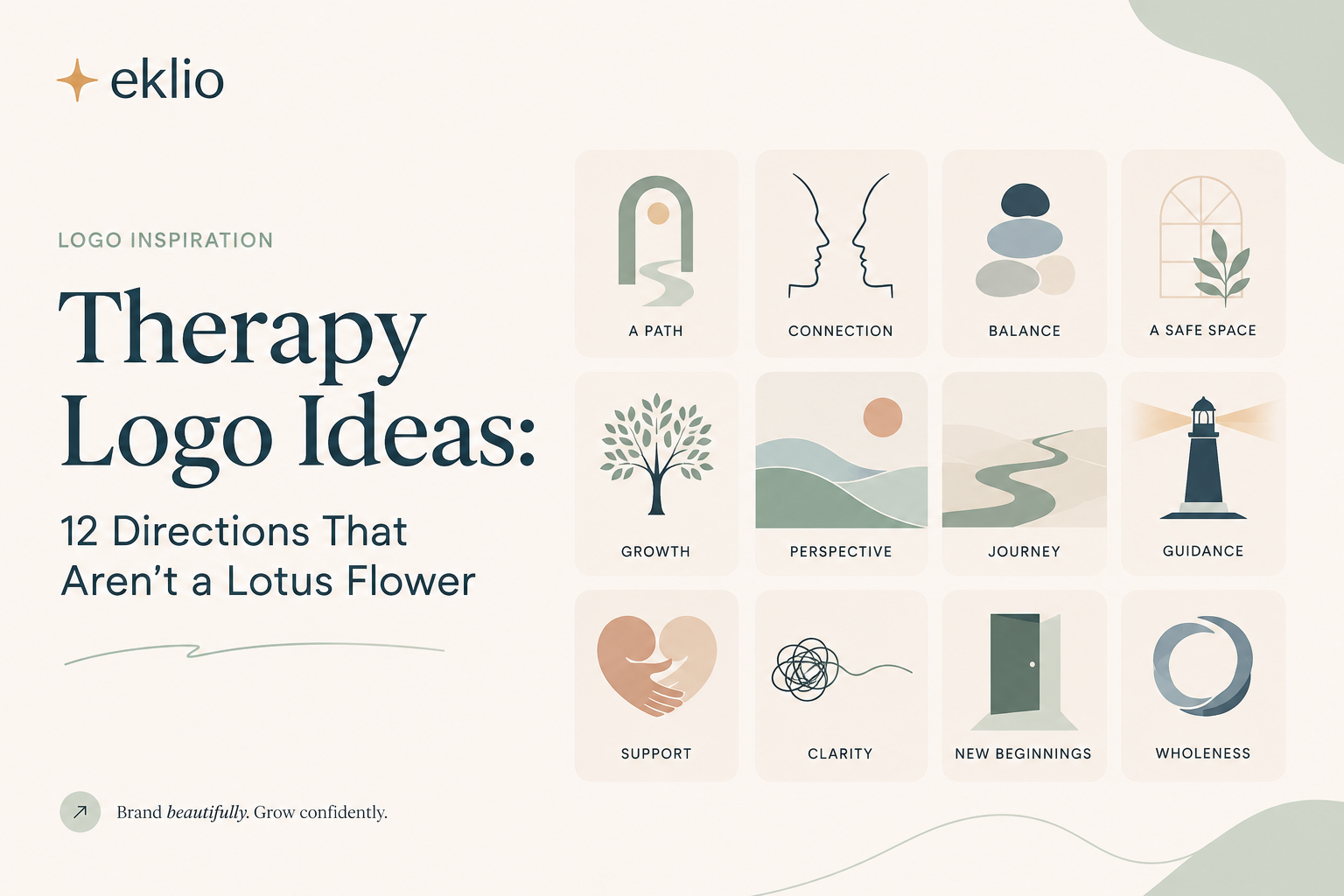
Therapy Logo Ideas: 12 Directions That Aren't a Lotus Flower
Half the private practices we sampled use one of the same five images. Here are twelve other directions, what each one signals to a nervous first-time client, and how to pick the one that fits your work.
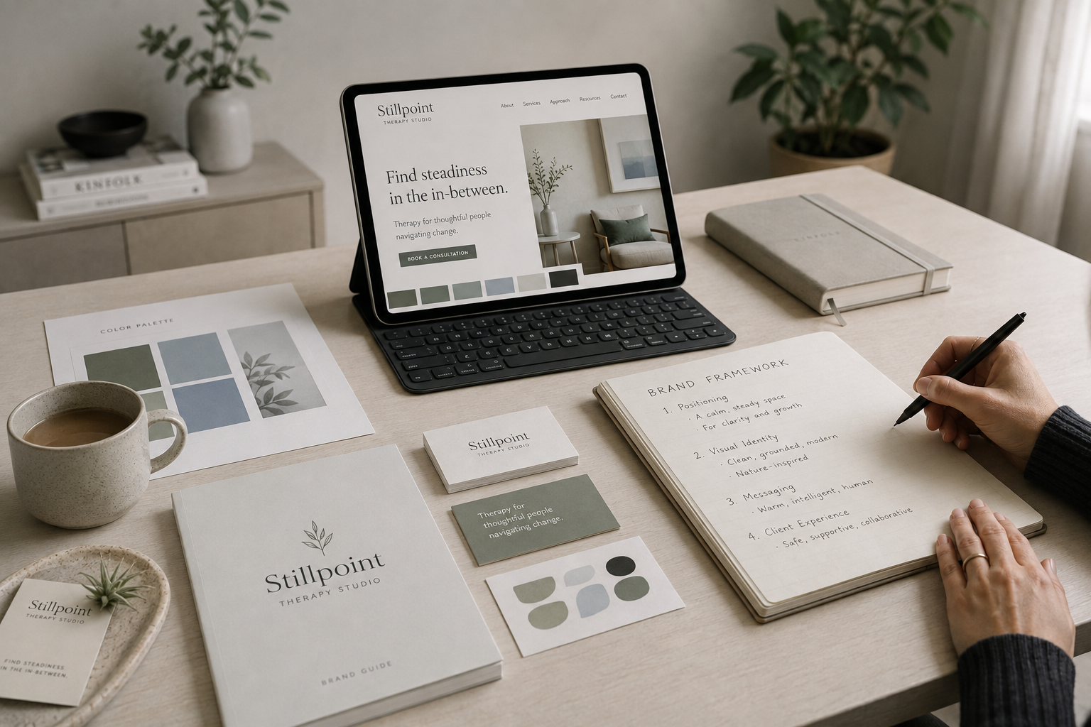
Branding for Therapists: A Step-by-Step Framework to Build Yours
If you're reading this, you've probably already made peace with the idea that your practice needs a brand. What you actually want is the next part: a sequence you can follow this week, not another article explaining why sage green and a lotus icon won't cut it.
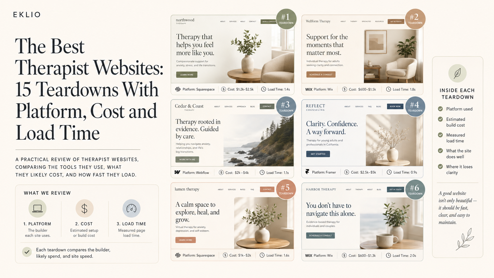
The Best Therapist Websites: 15 Teardowns With Platform, Cost and Load Time
Most "best of" lists for therapist sites are a gallery with no criteria. We opened the source on fifteen, ran each through Lighthouse on throttled mobile, priced the build, and ranked them.