LOGO & IDENTITY · SEPTEMBER 04, 2026
Therapy Logo Ideas: 12 Directions That Aren't a Lotus Flower
Half the private practices we sampled use one of the same five images. Here are twelve other directions, what each one signals to a nervous first-time client, and how to pick the one that fits your work.
Type "therapy logo" into a template tool and scroll. Around the fortieth thumbnail you notice you have seen all of this before: a lotus, a head in profile with a swirl where the brain should be, two hands cupping something small. The templates are competent. They are also interchangeable — the one thing a private practice cannot afford when a referral is choosing between you and four other names on a directory page.
A therapy logo does not have to symbolize therapy. It has to stay legible at 32 pixels, survive a decade of use, and tell an anxious person what kind of room they are about to walk into. Most of the real work happens before anyone draws anything: choosing a direction. There are twelve worth knowing, and they sort into three families.
The five clichés, and how often they actually show up
We pulled 200 US private-practice logos in August 2026 — solo LMFT, LPC, LCSW and psychology practices across eight states, from public practice sites and directory profiles — and counted the central image. Just over half used one of five things.
| Cliché | Times in 200 | What it was meant to say |
|---|---|---|
| Lotus or lotus-like petal form | 31 | Growth, calm, mindfulness |
| Head in profile with a swirl, spiral or leaves | 24 | The mind, thought, insight |
| Two hands cupping or reaching | 22 | Support, safety, holding |
| Tree with visible roots | 19 | Grounding, depth, family |
| Butterfly or emerging wing | 11 | Change, transformation |
None of these are bad drawings. The problem is arithmetic. If a client opens six tabs and four show a petal in a circle, your mark is doing none of the work you paid for. The lotus and the butterfly also carry a before-and-after promise, which sits close to an outcome claim you would never make in words.
What a therapy logo signals to a nervous person
People do not read logos. They react in about half a second, and what they react to is not the symbol's meaning but its temperature: stroke weight, the air around the letters, whether the shapes feel handled or manufactured. A thin, wide, lowercase wordmark reads calm and expensive. A dense geometric block reads clinical. A hand-drawn line reads warm and small — right for some practices, badly wrong for a forensic evaluator.
Match the temperature to the fear the client is bringing. Someone booking a first session for panic attacks wants steadiness. Someone looking for a couples therapist after an affair wants discretion. Someone hiring you for an ADHD assessment wants competence. Three very different marks.
Twelve directions: type-led
Type-led directions use letterforms as the logo. Safest bet for a solo practice: they never date, cost the least to produce well, and read at any size.
1. Quiet Wordmark
Your practice name in one carefully chosen typeface, letter-spacing opened slightly, nothing else. No icon. Best for names that are already distinctive, and for anyone who may shift specialty focus in the next five years. It signals composure — you are not decorating.
2. Type-Only Serif
The same idea with an old-style or transitional serif in title case. Serifs carry authority and age. This is the direction for assessment work, expert-witness practice, supervision, and anyone whose referrals come from physicians. It signals rigor, and can read formal — a feature in some rooms, a wall in others.
3. Monogram
Two or three initials locked into a considered shape, sometimes inside a light frame. Useful when the legal name runs long ("Alvarez Family Therapy & Perinatal Counseling, PLLC") and you need something square for an avatar. Done badly it signals law firm, so keep the frame minimal.
4. Hand-drawn Signature
Your name in a genuinely drawn script, redrawn cleanly rather than pulled from a font. Best for art therapists, play therapists and expressive-arts practices where the relationship is the product. It signals a person, not an institution. It fails at small sizes, so it always needs a plain companion lockup.
Twelve directions: form-led
Form-led marks pair a wordmark with an abstract shape that is not trying to represent anything. This is the family template libraries never offer, and where the most distinctive therapy logos live.
5. Architectural Line
One continuous line drawn with the discipline of a floor plan — an arc, a corner, a break. Nothing organic. Best for trauma work, EMDR, and anyone whose clients need to feel the structure will hold. It signals containment and precision without going cold, because a single line still reads as a hand at scale.
6. Geometric Anchor
A pure shape — circle, soft square, truncated triangle — fixed beside the name. Its job is stability. Best for group practices, because a simple anchor sub-brands easily per clinician or service line and holds up on a building sign. It signals reliability, and slightly less warmth than the alternatives.
7. Grid
Small repeated units in a deliberate arrangement: four squares, nine dots, three stacked bars of unequal weight. Good for multi-service or multi-clinician practices, and for neurodiversity-affirming work, where the pattern reads as order without hierarchy. Keep the unit count low enough to survive a favicon.
8. Weight
No shape at all — the meaning comes from contrast within the type. One word heavy, the rest light. Cheapest direction to execute and the hardest to execute well: with nothing to hide behind, the typeface choice is the entire design. It signals editorial confidence.
Twelve directions: concept-led
Concept-led marks carry an idea, but an abstracted one. The rule that keeps them out of cliché territory: the shape reads as a shape first and a metaphor second.
9. Container / Vessel
An open form that holds space — a bracket, an unclosed bowl, a rounded frame with one side missing. The honest version of the cupped-hands idea, without the hands. Best for group therapy and grief work, where the promise is a held space rather than a fix. Closed containers read as confinement, so leave a side open.
10. Path
A line that changes direction and does not return to where it started. Not a spiral, which reads as looping and, to some clients, as rumination. Best for career-adjacent work, ACT-oriented practices and adolescent counseling. It signals movement without promising a destination — which matters, because a mark should not imply an outcome your consent form does not.
11. Threshold
A doorway, a gap between two forms, a break in a line — the most underused direction in the set. Best for intake-heavy practices and first-time-therapy audiences, where the real problem is hesitation before booking. Two vertical strokes with air between them do the whole job.
12. Botanical-Abstracted
Plants are not banned — literal ones are. Abstract a leaf to two strokes, or take a stem and drop the foliage. Best for perinatal and wellness-adjacent practices where clients expect softness. The test: cover the name, and if a stranger would still call it a plant illustration, keep abstracting.
Which direction reads as what
| Direction | Clients tend to read | Strongest fit |
|---|---|---|
| Quiet Wordmark | Composed, current, unfussy | Solo generalist, evolving niche |
| Type-Only Serif | Credentialed, serious | Assessment, supervision, forensic |
| Monogram | Established, professional | Long practice names, group practices |
| Hand-drawn Signature | Personal, small, warm | Art, play, perinatal |
| Architectural Line | Contained, precise | Trauma, EMDR |
| Geometric Anchor | Stable, dependable | Group practices, multi-site |
| Grid | Organized, non-hierarchical | Neurodiversity-affirming, multi-service |
| Weight | Confident, editorial | Coaching-adjacent, executive clients |
| Container / Vessel | Safe, held, open | Grief, group work |
| Path | Forward-moving, non-prescriptive | ACT, adolescents, life transitions |
| Threshold | Welcoming, low-pressure | Intake-heavy, first-time clients |
| Botanical-Abstracted | Caring, gentle | Perinatal, wellness-adjacent |
None of these directions locks your color choices — the same architectural line works in ink and clay or in navy and bone, and the palette decision comes after the shape is settled. And direction beats execution for differentiation, not for quality: a well-drawn wordmark outperforms a clumsy threshold every time.
What to hand a designer
If you are hiring out, the gap between a $2,500 identity that works and one that does not is almost entirely the brief. Name the direction from this list. Name the two temperatures you want and the one to avoid. State the four places the mark must survive: favicon, directory thumbnail, superbill header, printed card. And say what you will not accept — no lotus, no head-and-swirl. It saves a full round of revisions.
If you are not hiring out, you can see all twelve directions applied to your own practice name in about seven minutes. Eklio takes a short brief and returns a full kit — mark, palette, type, and export prompts for Squarespace, Wix or Framer — from $79, roughly what a designer's first meeting costs. See what's included.
Worth saying plainly: no logo direction brings you clients. It stops you losing them in the half-second before your first sentence. Get it to not interchangeable, then spend your energy on the words.
FAQ
Should my therapy logo say what kind of therapy I do?
Rarely. A specialty-specific mark ages badly — the perinatal practice that adds adolescents in year three ends up with a logo arguing against its own website. Let the tagline carry the specialty and the mark carry temperature. The exception is a practice built around one modality, permanently.
Is a template logo ever acceptable?
Yes, in one case: you are pre-licensure, cash is tight, and you pick a type-only direction. A clean wordmark in a good typeface is honest work. Avoid the template icon — that is what duplicates across other practices in your city.
Can I use a client's feedback about my logo in my marketing?
No — not as a testimonial. ACA C.3.b prohibits soliciting testimonials from current clients and from former clients who may still be vulnerable; APA 5.05 and NASW 4.07 set comparable limits. Ask colleagues or people outside your caseload instead. Board rules vary by state, so check yours before publishing any endorsement.
How many colors should a therapy logo use?
One, plus black or a near-black. The mark should work in a single flat color first, because that is how it appears on a fax cover sheet, an embroidered polo and a directory thumbnail. Add the second color only after the one-color version is finished; our logo fundamentals piece covers the lockup variants you will need.
Your practice, branded. In under an hour.
A guided brief, three directions, and website copy ready to paste in.
Build my brand kitMore in Logo & Identity
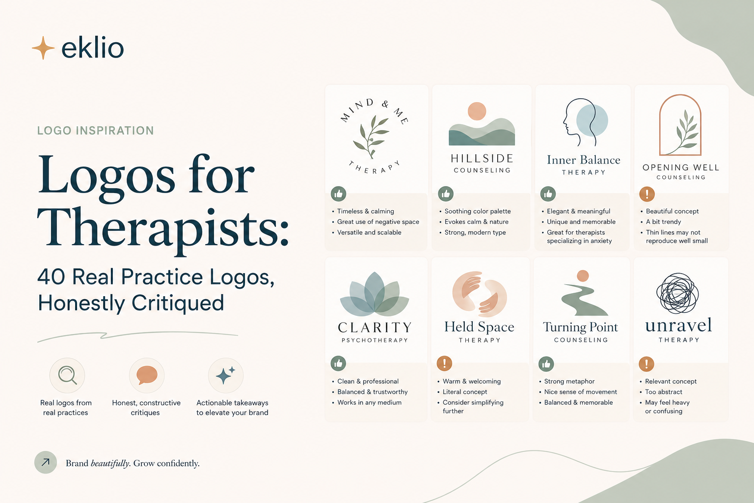
Logos for Therapists: 40 Real Practice Logos, Honestly Critiqued
We shrank forty real therapist logos to 32 pixels to see which ones survived. Eleven did. Here is what the other twenty-nine got wrong, and the six symbols we saw over and over.
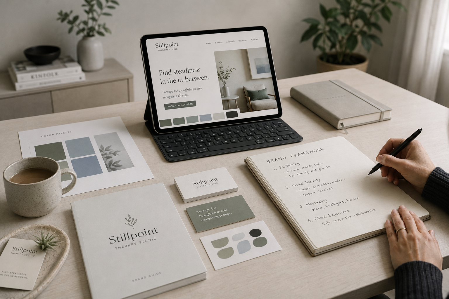
Branding for Therapists: A Step-by-Step Framework to Build Yours
If you're reading this, you've probably already made peace with the idea that your practice needs a brand. What you actually want is the next part: a sequence you can follow this week, not another article explaining why sage green and a lotus icon won't cut it.
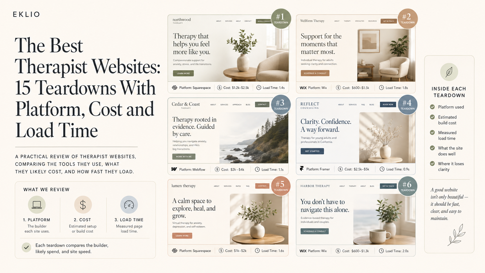
The Best Therapist Websites: 15 Teardowns With Platform, Cost and Load Time
Most "best of" lists for therapist sites are a gallery with no criteria. We opened the source on fifteen, ran each through Lighthouse on throttled mobile, priced the build, and ranked them.